New This Week: 4 Inviting Kitchens With Light Wood Cabinets
See how natural wood cabinets give various kitchen styles warmth and flair
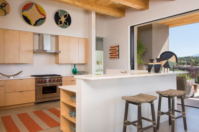
2. Desert Modern
Builder: Zachary & Sons Homes
Location: Santa Fe, New Mexico
Size: 340 square feet (32 square meters); 17 by 20 feet
Homeowners’ request. “We worked directly with the homeowner to design this midcentury-inspired custom home,” project manager Joshua Shultz says. “The vision for the kitchen was to have a clean and peaceful flow, free of busy backsplash tile and cabinet door hardware. They wanted this room to speak ‘simplicity’ yet be defined by the sophisticated clean lines and natural wood cabinetry. The kitchen is where the homeowners spend most of their time, preparing meals, looking out the slider glass doors at the mountains and socializing with friends.”
Cabinets. Flat-panel maple. “We chose to use maple for the cabinets in order to capitalize on its beautiful grain and durability,” Shultz says. “The natural stain works to warm the room up against the white wall plaster and custom concrete floors. The cabinet’s flat-panel style matches the sharp lines of the home. To allow for functionality but sleekness, we inserted the cabinet hardware at the bottom of the cabinetry so that it is almost invisible.”
Other special features. Natural white plaster backsplash with a matte sealer. White fir wood beams. Tongue-and-groove ceiling.
Designer tip. “Keep things natural and simple,” Shultz says. “This will make for an open, white and bright kitchen full of warmth and happy feelings.”
“Uh-oh” moment. “With such a minimalist design, we risked making the home feel stale or bare,” Shultz says. “At first we were going to put traditional-modern cabinet hardware on the face of the cabinetry to add something to the big picture of the room and engage the eye a little more actively. However, when we sampled this method, we found the hardware distracting and realized that it did not cultivate the feeling we were going for. Luckily, we were able to work together to bring warmth and some movement into the space without needing anything overly visually distracting.”
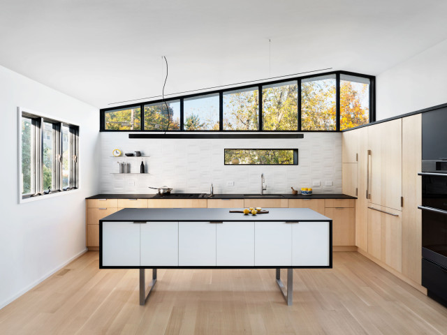
3. Contemporary
Designer: Justin Blejer of Blejer Architecture
Location: South Nyack, New York
Size: 391 square feet (36 square meters)
Homeowners’ request. A contemporary kitchen in a new location in the house to create better relationships among the kitchen, dining and living areas. “They also gained an additional view to the Hudson River from the kitchen,” designer Justin Blejer says.
Cabinets. Natural quarter-sawn white ash veneer. “We contrasted the wood with a minimal palette of white tile, black counters and black stained ash,” Blejer says. “Additionally, the hardware was mostly satin nickel.”
Other special features. “One of the main special features was having the island designed to feel as a piece of furniture,” Blejer says. “This lets the space feel larger, as you can see under and past the island, but it remains functional with drawers on the kitchen side and bar cabinets on the other side. Additionally, the lighting is very much tailored to the kitchen design. There are spotlights to highlight the tile backsplash, a concealed uplight that reflects light off the vaulted ceiling, a handmade steel pendant and black adjustable mono-point spots to highlight the island and wall art.”
Designer tip. “I think this project benefits from persistence [in keeping] the design simple despite the complexity inherent in a kitchen,” Blejer says. “Every appliance, counter, cabinet door etc. has its own needs and requirements and wants to push the design, and it takes effort to keep the final project harmonious and clear. It can get sloppy quickly if you don’t care.”
“Uh-oh” moment. “The design of the new window in the backsplash wall,” Blejer says. “I designed the window dimensions such that the black shadow box surround fits exactly within the tile grid without cutting a single tile. Additionally, the tiles at the counter, the clerestory window and the west wall are not cut either. On top of that, the tiles are handmade and have dimensional variation. The window had to be ordered before the tile arrived, so essentially this was a near-zero-tolerance installation that required us to measure and remeasure to ensure it was installed just right. Kudos to the contractors for getting behind the design.”
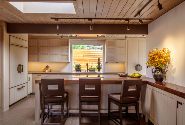
4. Asian-Inspired
Designers: David Ludwig (architect) and Candace Killman (interior designer)
Location: San Rafael, California
Size: 288 square feet (27 square meters); 12 by 24 feet
Homeowners’ request. “The owners and the design team agreed on a contemporary Japanese-style interior with tansu-style cabinets and exposed hardware,” architect David Ludwig says. “They wanted a sit-at peninsula with the cooktop facing into the adjacent family room alcove.”
Cabinets. Rift-cut white oak.
Other special features. Exposed tansu-style hand-wrought hardware in oil-rubbed-bronze finish. Tansu-style paneling for the contemporary built-in French door refrigerator. The countertops on the peninsula transition from Dekton to walnut.
Designer tip. “Adding egg-crate louvers to the downlight track heads eliminates glare from looking directly into the light source,” Ludwig says.
Lighting: Tellium track heads in bronze, Tech Lighting; wall paint: Frosted Toffee, Benjamin Moore


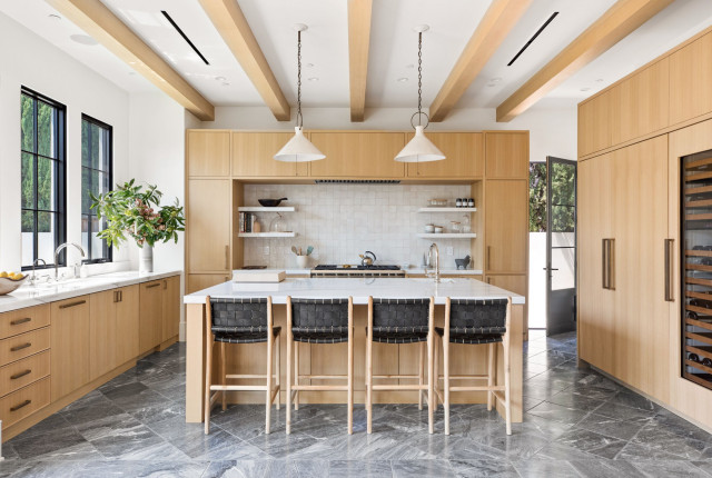
1. Transitional
Designers: Oren Levy of Luxe Remodel and Krista Schrock and David John Dick of DISC Interiors
Location: West Hollywood, California
Size: 167 square feet (16 square meters); 14½ by 11½ feet
Homeowners’ request. For this new-build home, they wanted an emphasis on function and spaces designed with symmetry, natural tones and organic lines.
Cabinets. Flat-panel rift-cut oak. “To contrast, we used brass hardware, dark marble flooring and terra-cotta backsplash tile,” design-build pro Oren Levy says.
Other special features. Marble shelves. Beamed ceiling. Ceramic pendant lights.
Designer tip. Focusing on symmetry resulted in an alluring design.
Find a kitchen remodeler near you